MEO Training Club
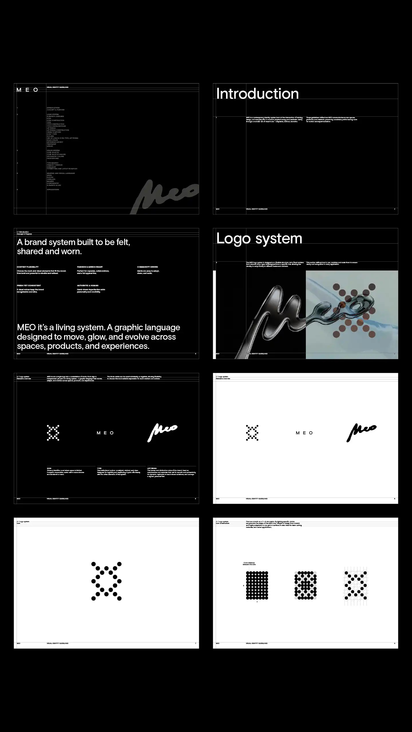
A brand system built to be felt, shared and worn.
MEO Training Club is a new space in Paris. It’s a living system. A hybrid playground fusing physical and mental training, food, fashion and lifestyle. The graphic language is designed to move, glow, and evolve across spaces, products and experiences.
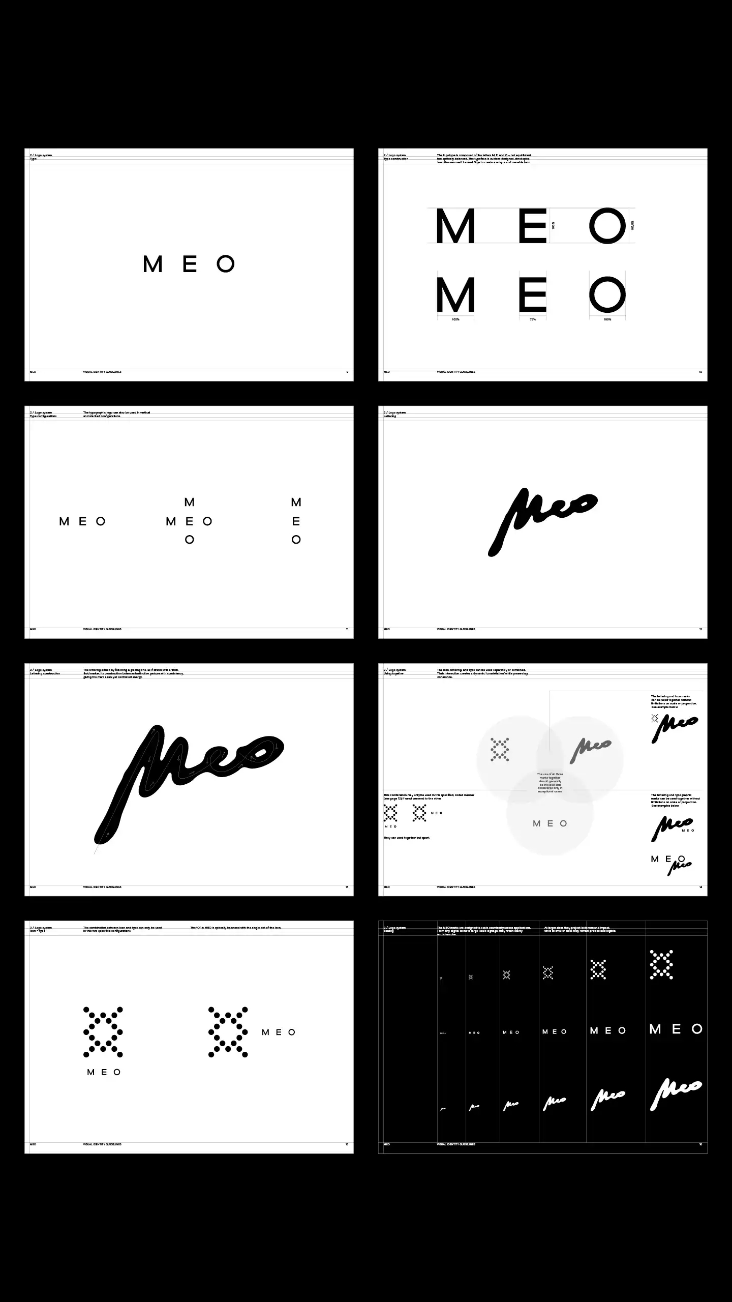
ICON
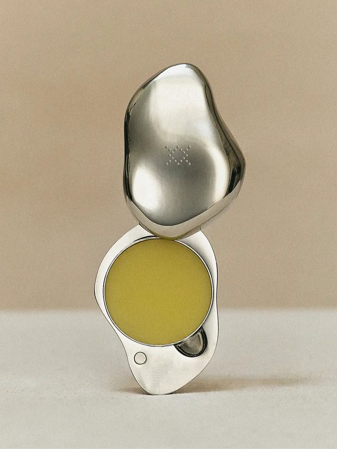
Primary identifier, used where space is limited. Compact, memorable, works well in monochrome and as stencil or neon.

TYPE
The institutional anchor: consistent, minimal, and clear. Designed for legibility and wayfinding, it pairs effortlessly with the other elements of the system.
LETTERING
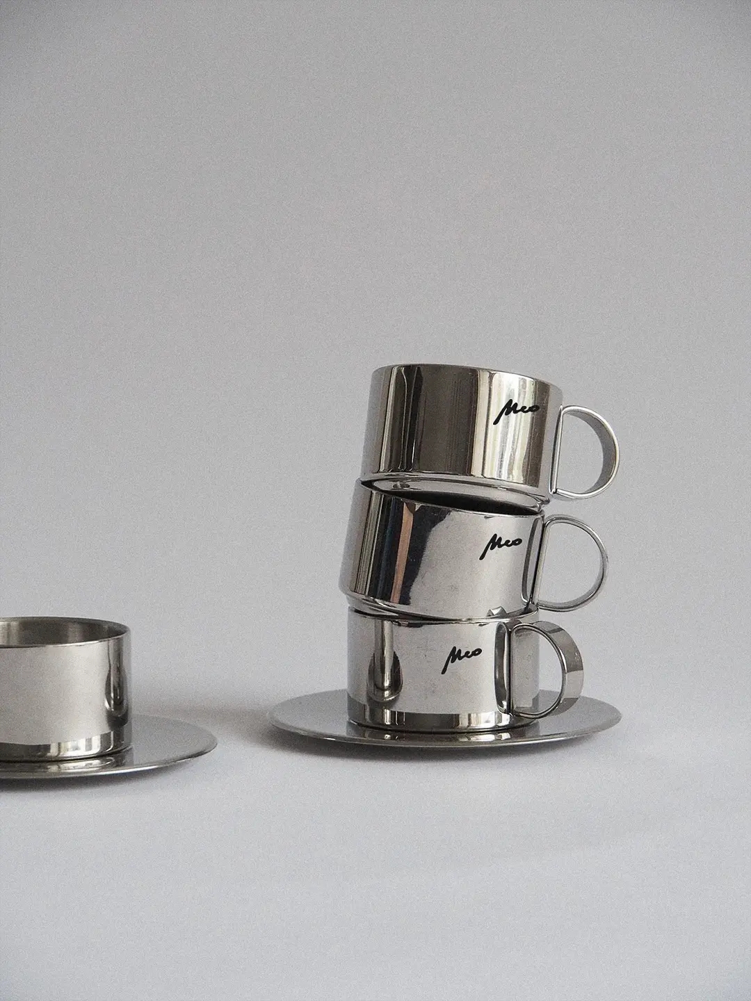
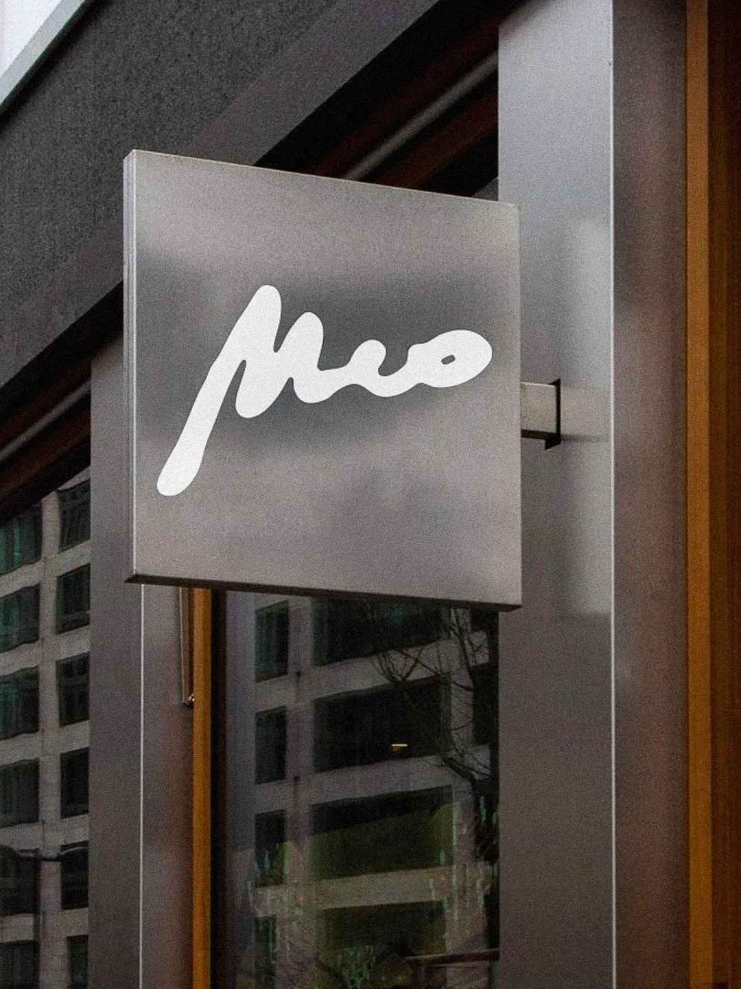
The human and distinctive voice of the brand. Used on merchandise and materials that call for warmth and authenticity, it’s dynamic, replicable in hand-drawn variations, and conveys a signed, personal feel.
MEO Training Club
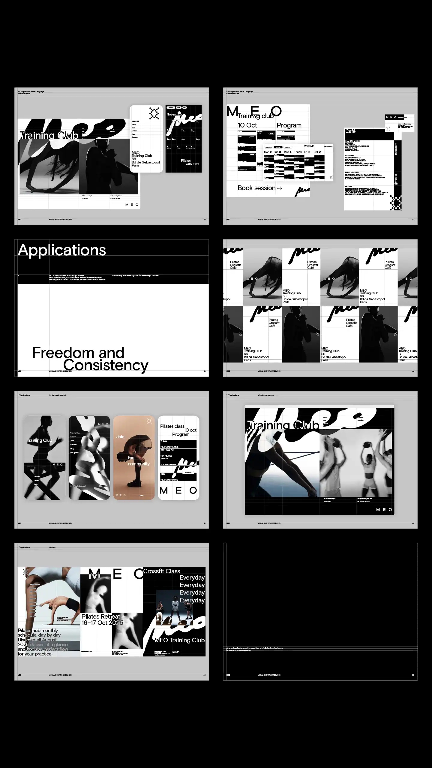
MEO is a contemporary identity system designed as a flexible, living structure that moves, glows, and evolves across physical spaces, digital platforms, and products. Born at the intersection of training, design, and everyday life, it connects raw physical energy with aesthetic clarity through a modular set of visual tools, balancing structural discipline with creative freedom. This context flexibility allows the brand to shift from powerful to mindful tones, making it inherently ready for apparel lines, capsule collaborations, and community remixing.
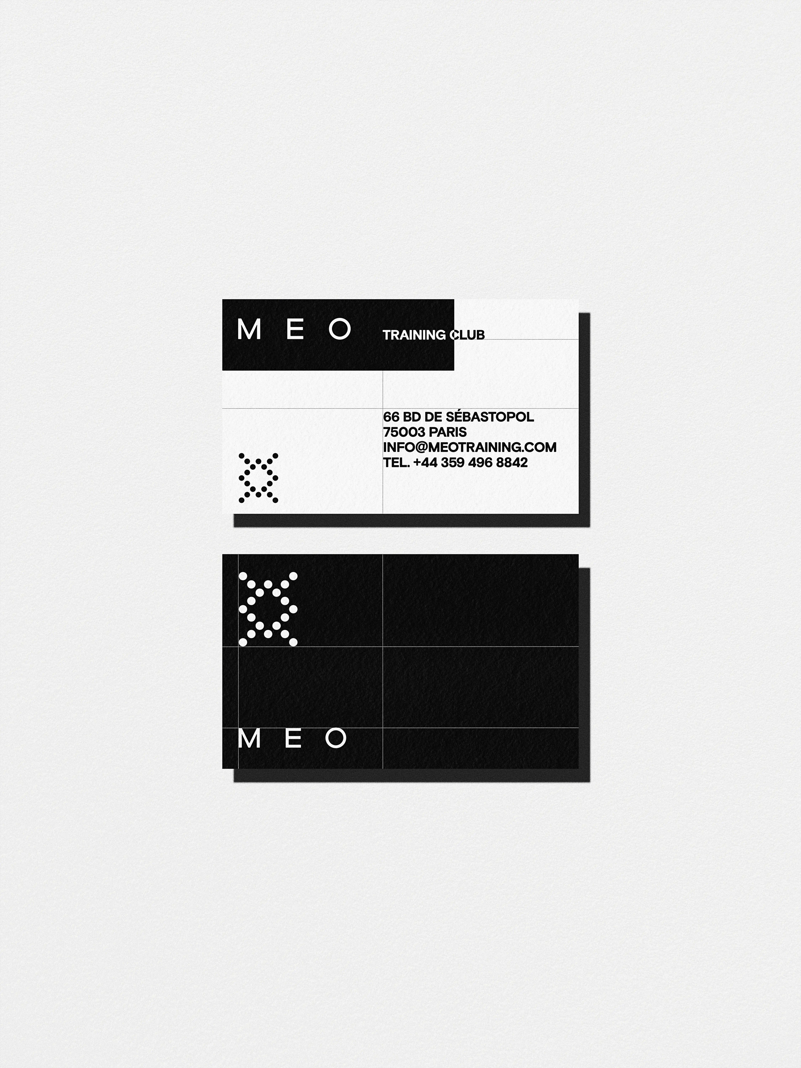
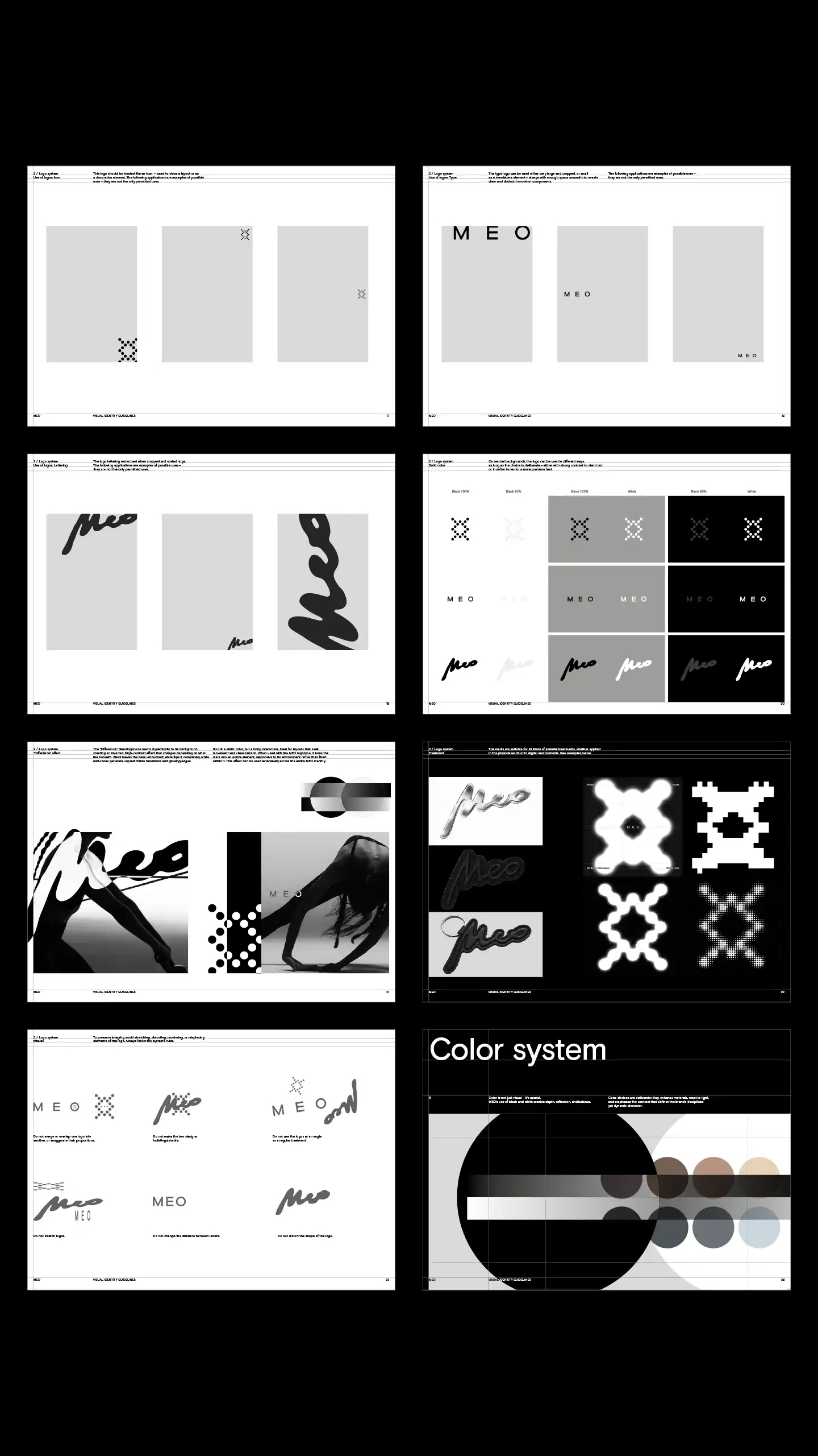
The brand’s logo system functions as a constellation of three independent visual voices. The Icon is a primary identifier built on a mathematically balanced dot matrix optimized for neon grids, stencils, or laser cutting. The institutional Type logotype, custom-developed from Lexend Giga, uses optically balanced letters designed for absolute legibility. The hand-drawn Lettering conveys an instinctive, human voice ideal for merchandise and apparel.
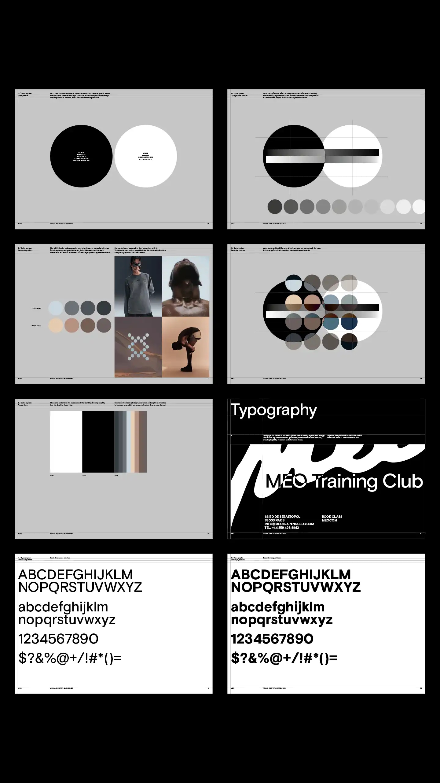
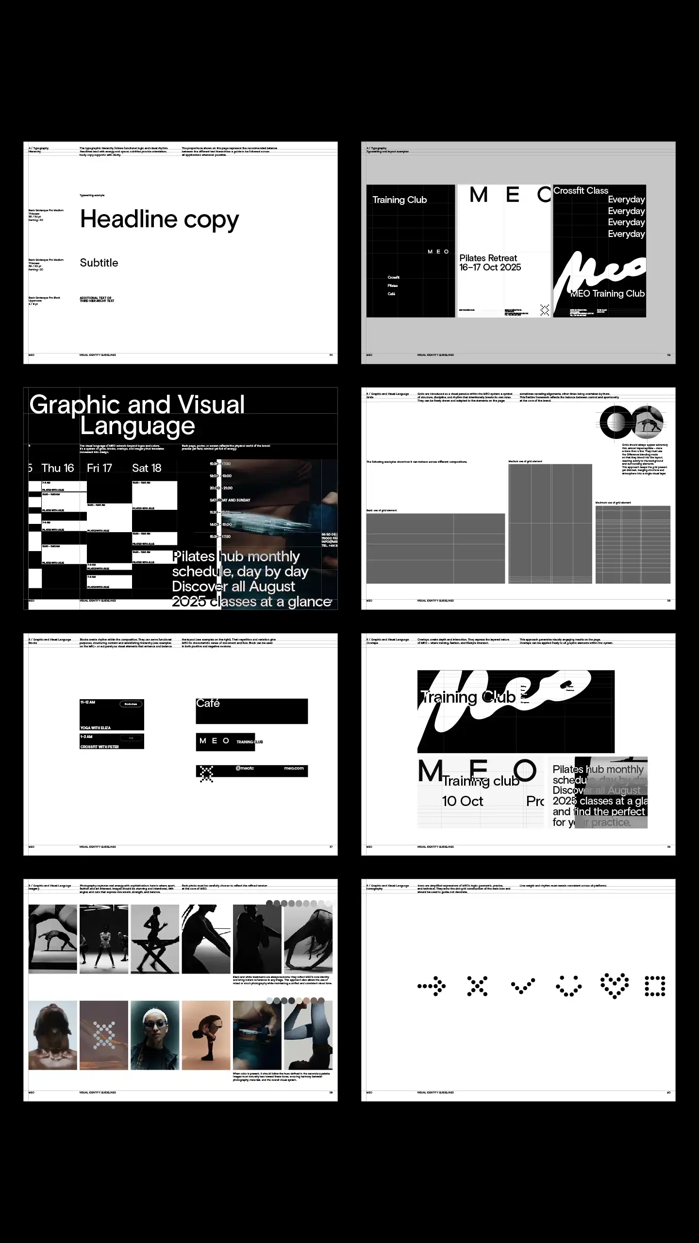
The color framework treats hue as a spatial element rather than flat decoration. Absolute black and white anchor the palette, dictating roughly two-thirds (66%) of the visual field. The remaining third utilizes muted warm and cold secondary tones extracted directly from environment materials and ambient photography. Central to this system is the Difference blending effect, which forces overlapping elements to flip their values dynamically creating glowing edges, inverted states, and high visual tension.
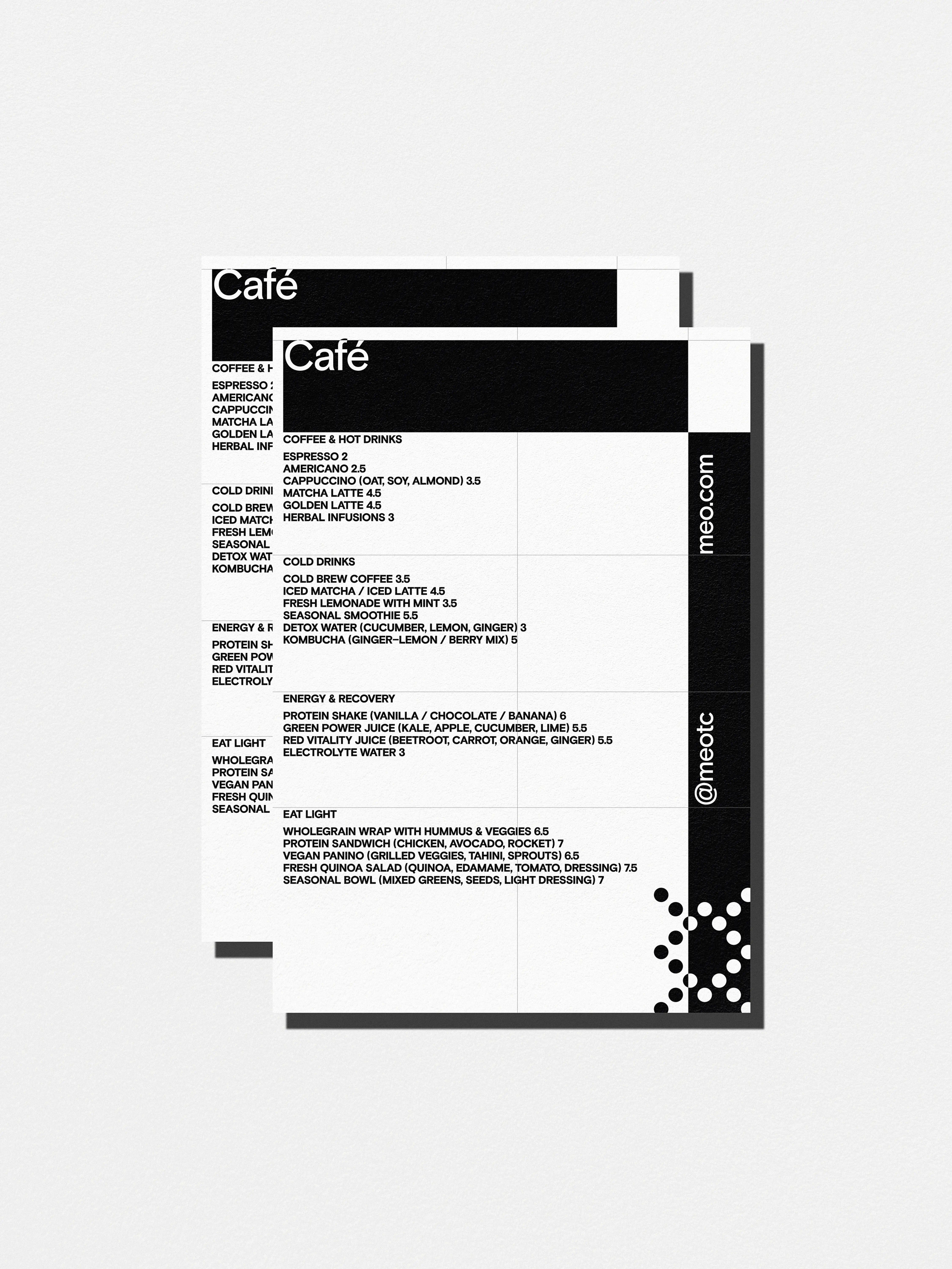
Typography leans on Basis Grotesque to establish a rhythmic voice where aggressive, tightly-kerned headlines project raw energy, uppercase subtitles provide structural navigation and clean body copy ensures functional clarity.
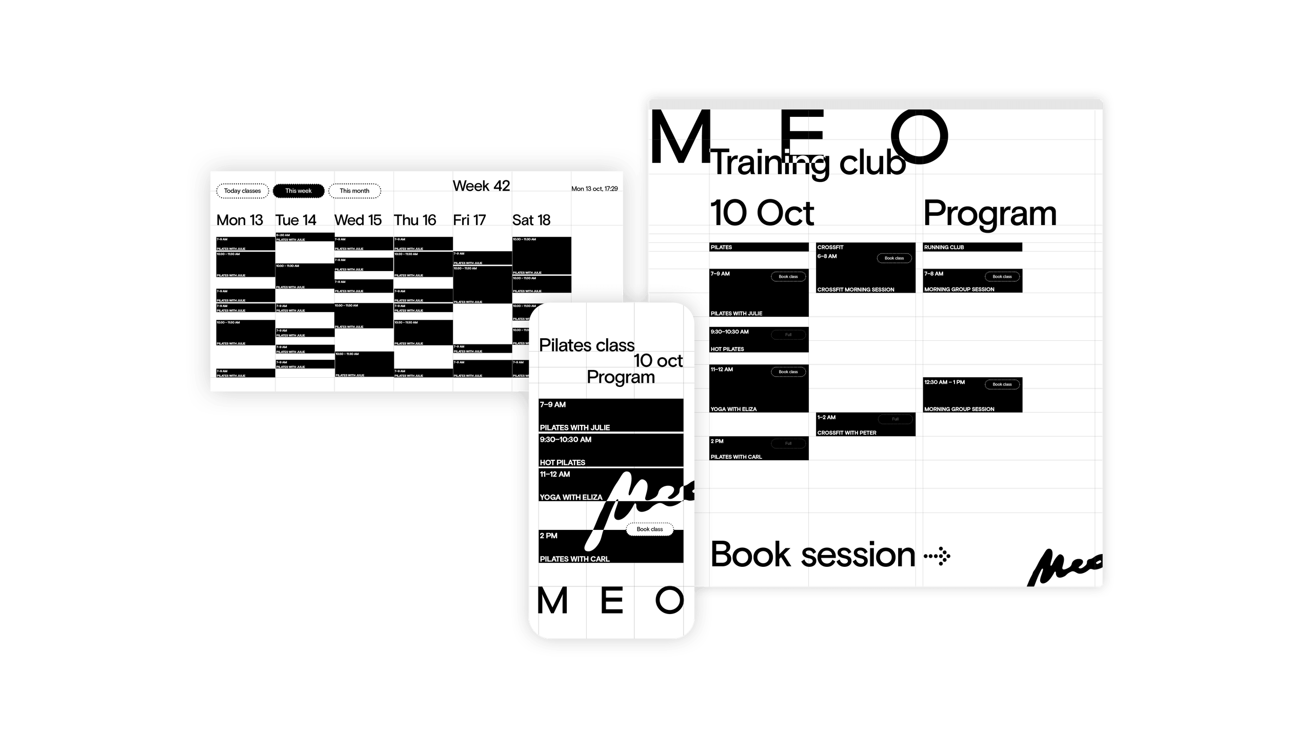
This visual lexicon dictates all layouts through a specific graphic language: ultra-thin paradox grids that reveal and intentionally break alignments, structural color blocks that organize scheduling data and layered overlaps that visually mirror the intersection of sport, fashion, art, and café culture. Finally, sophisticated brand imagery avoids staging, relying on high-contrast monochrome treatments to isolate motion, raw strength, and disciplined athletic energy.
Credits
Sezione Grafica
Art Direction:
Aldo Caprini, Flavia Lunardi
Graphic Design:
Flavia Lunardi
Giovanni Zamperlini
Motion design:
Giovanni Zamperlini
Roberto Cannarile
Progetti correllati